Wunder Mobility

Wunder Mobility

2020

2020

Improving accessibility and customizability in a white label app

A vision for Wunder Mobility's white-label app to better adapt to new sharing models, including a streamlined registration flow, enhanced, and improved system status visibility, which boosted signups and user confidence.

TL;DR

Wunder Mobility offers a SaaS platform for sharing operators and help them launch, manage & scale their vehicle sharing service. At the time of the project, we had 50 clients and over 10 million active users.

I led the UX and Product Team in revamping Wunder Fleet's whitelabel app to adapt to new sharing models, focusing on research, customer insights, and high-quality UX standards. This effort resulted in a streamlined registration flow, enhanced UI modularity, and improved system status visibility, boosting signups and user confidence.

Although the project was interrupted by COVID-19 and I left before its completion, the progress demonstrated significant potential for the app's future success.

My role

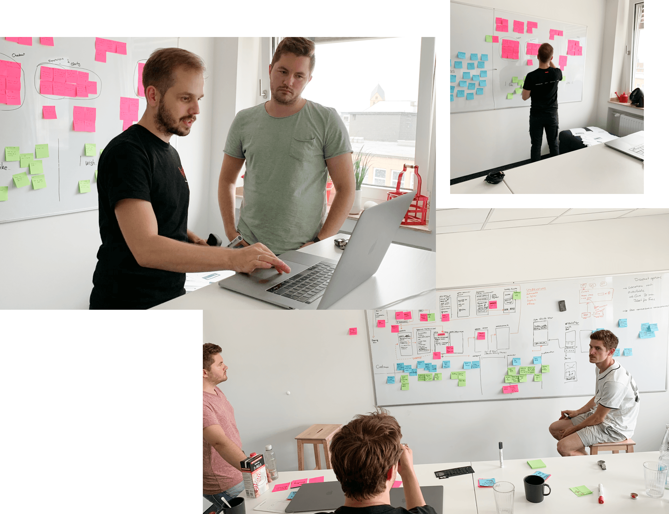
Working closely with a Product Lead and another Product Designer, I spearheaded the research and discovery phase, gathering valuable insights through customer interviews, design sprints, and user tests. I guided the UX and Product Team through the ideation process, and made sure that we maintained high-quality UX standards during implementation.

Problem

Wunder Fleet's whitelabel app, initially designed for scooter and car sharing, struggled to adapt to new sharing models. This led to workarounds and hardcoded features, causing usability flaws and accessibility issues due to extensive color use.

Approach

We began with a thorough discovery phase, analyzing current usage, mapping flows, identifying workarounds, and conducting competitive analysis and customer interviews. Key findings were clustered to address issues in sprint sessions, focusing on customizable flows and UI. We prioritized immediate bug fixes, issues for the northstar concept, and design principles, collaborating with cross-functional teams for insights and feedback.

Outcome


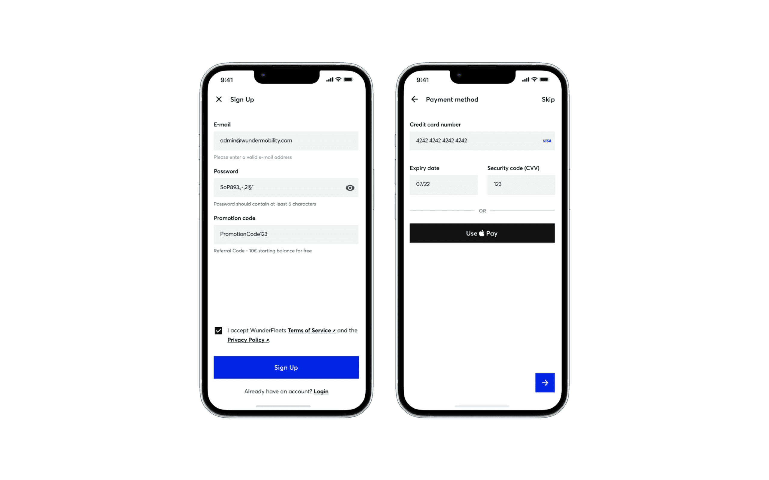
Registration

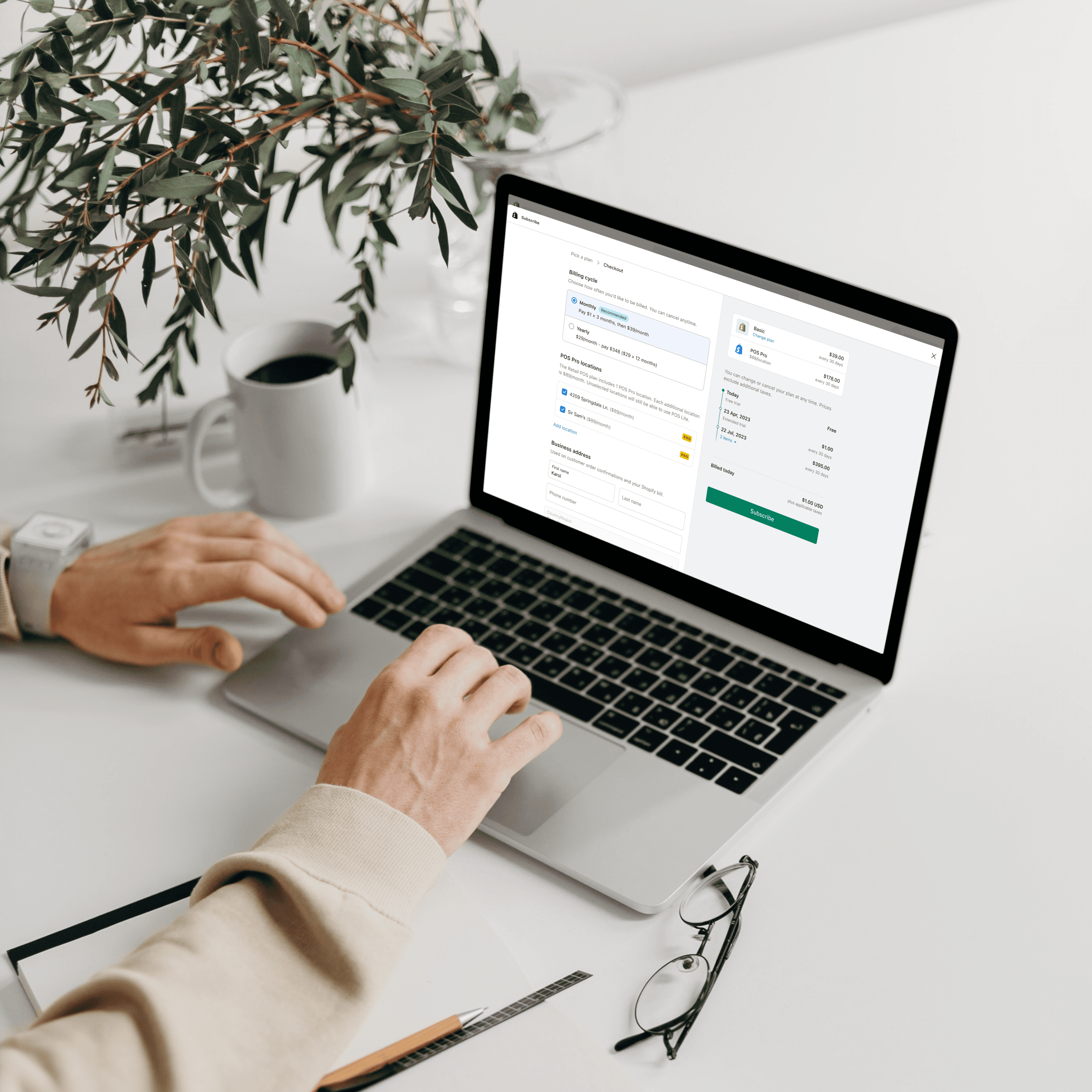
The registration process was split into two steps, allowing users to sign up without specifying a payment method initially. This change provided operators with the opportunity to follow up and resulted in an uplift in signups.
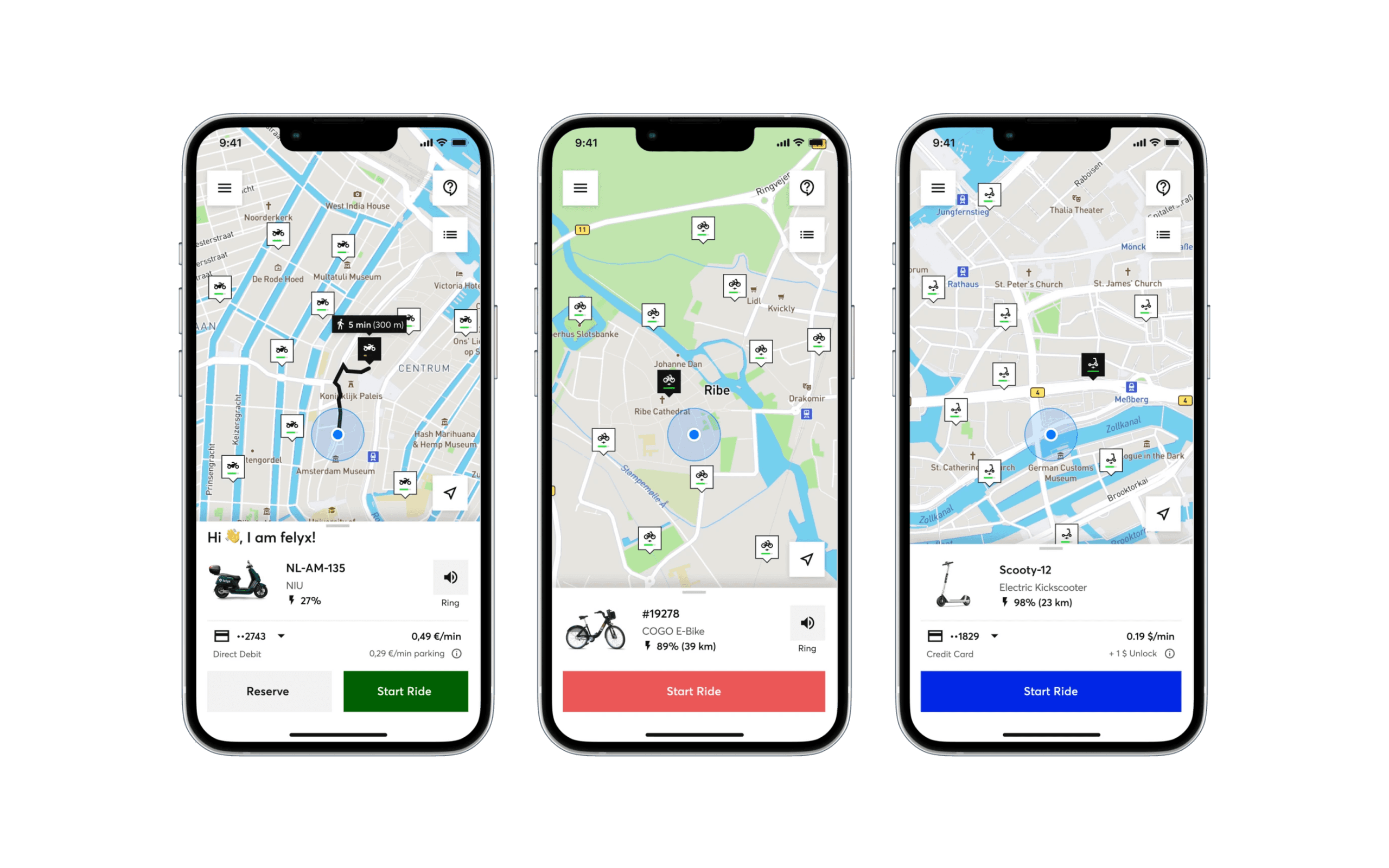

Modularity & Resilience

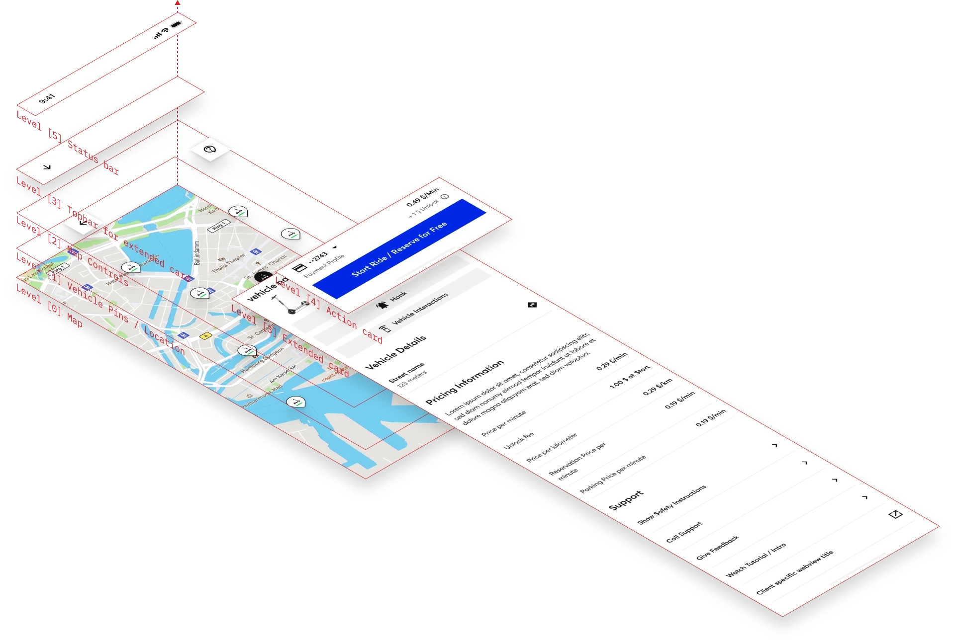
Enhancements were made to the app's components, ensuring that unused elements no longer created voids in the interface. Better space utilization resulted in a more compact and comprehensible UI.
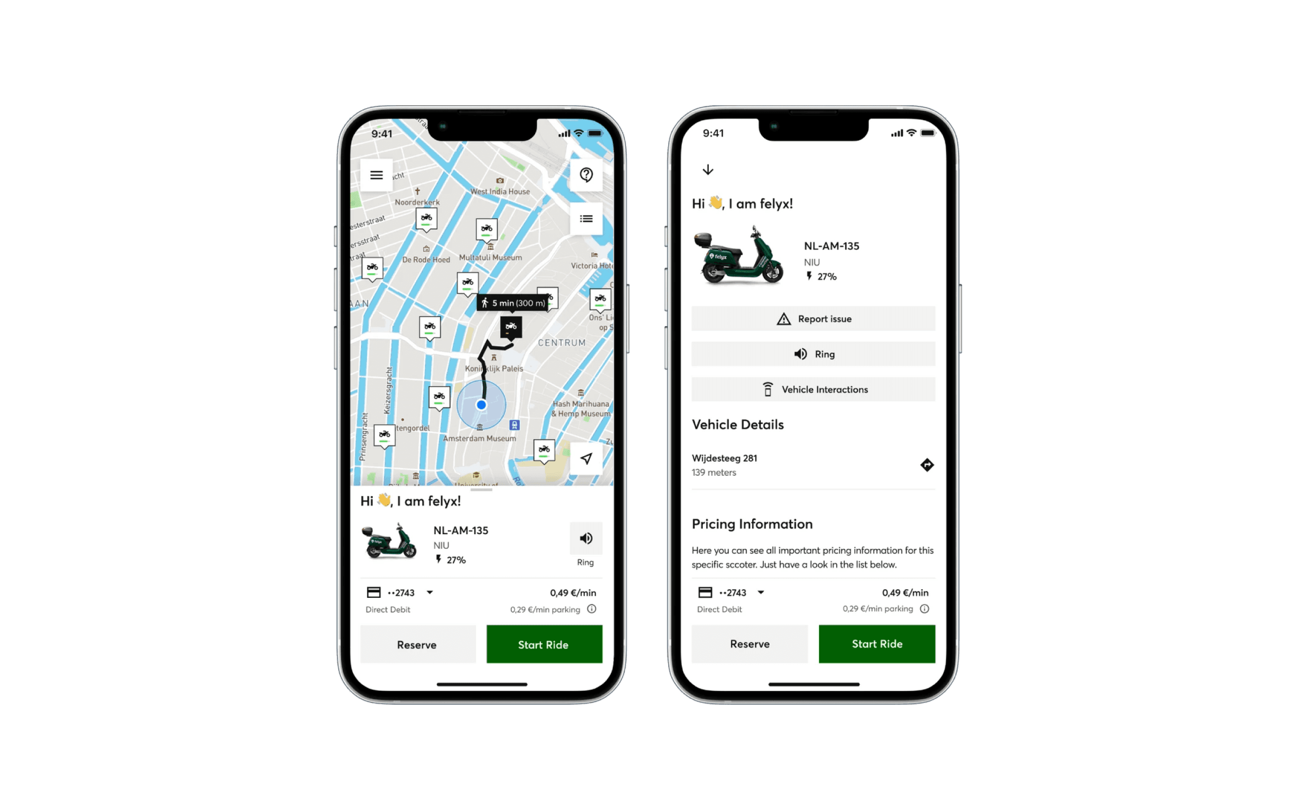

Extended Bottom Sheet

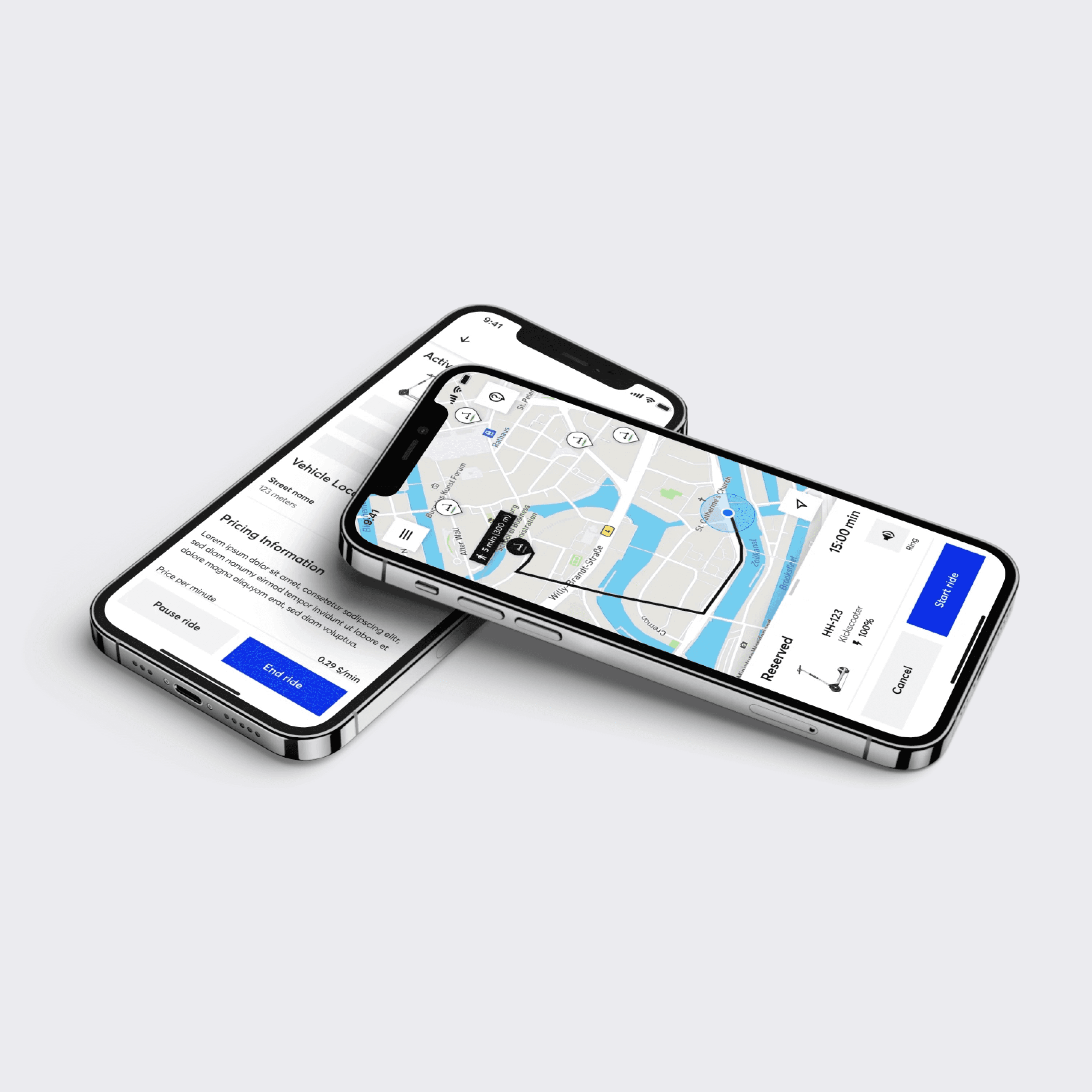
To accommodate secondary information, an extended bottom sheet component was introduced. This provided operators and users with a dedicated space for accessing additional vehicle details.
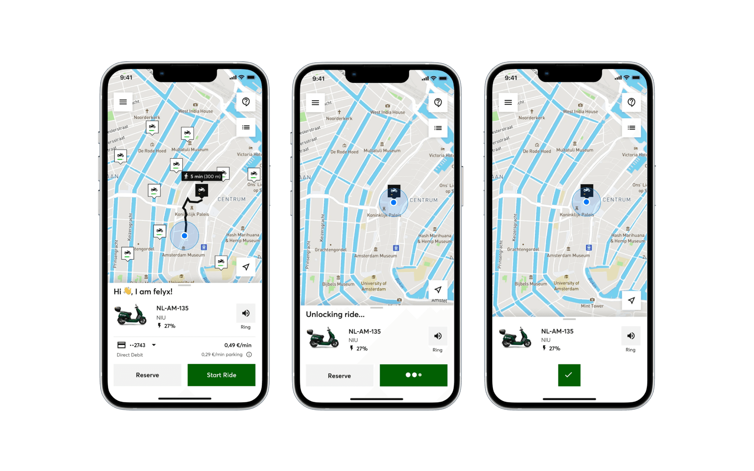

Visibility of System Status

Appropriate loading states, visual and haptic feedback, and alerts were implemented to provide users with clear indications of system status and actions performed. This improved user confidence and reduced uncertainty.
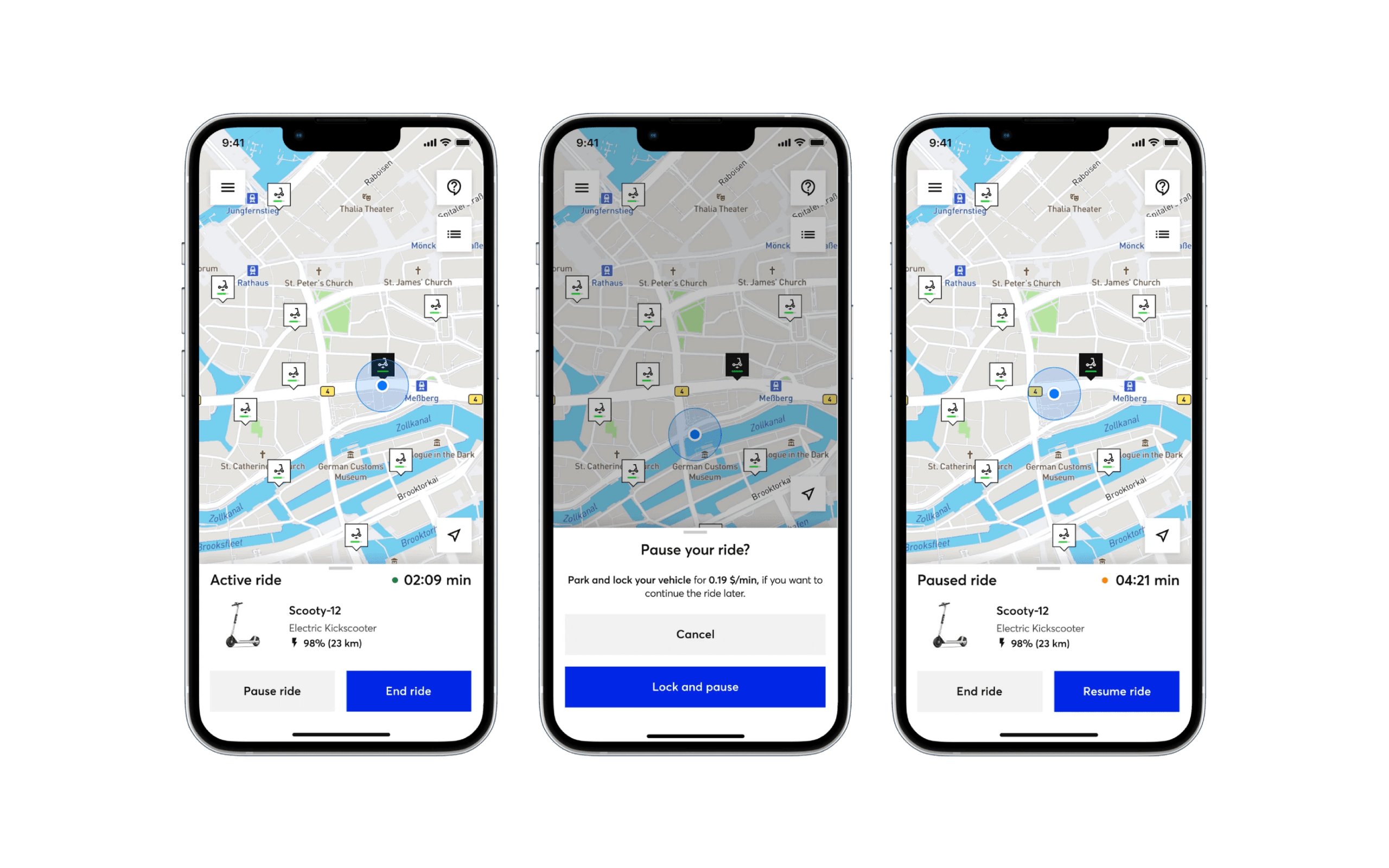

Improved Parking Mode

The parking mode was refined to prevent user errors. Users were now able to only lock the vehicle during a trip, ensuring full attention was given to the interaction and allowing them to consciously decide whether to end the trip or pause it.
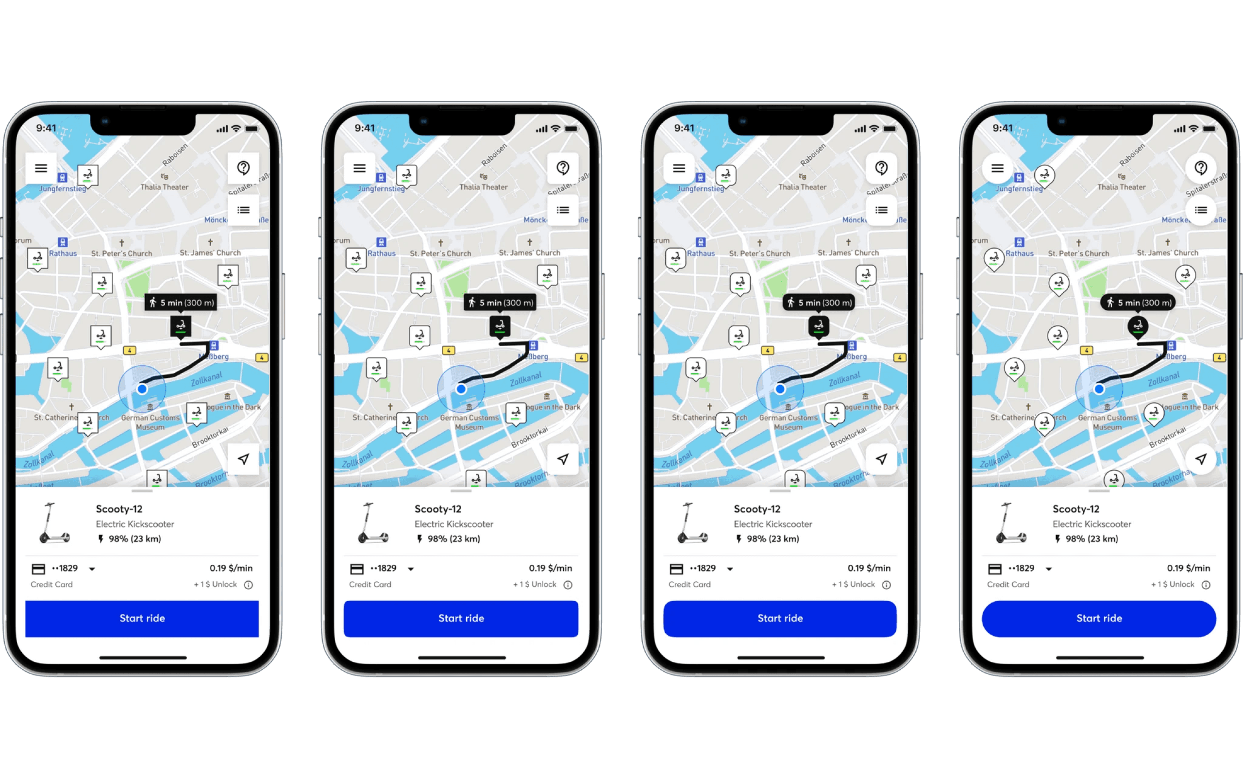

Theming

Customization options were expanded, allowing operators to personalize the app to align with their brand requirements. Additionally, four pre-defined themes were introduced to better meet diverse brand needs.
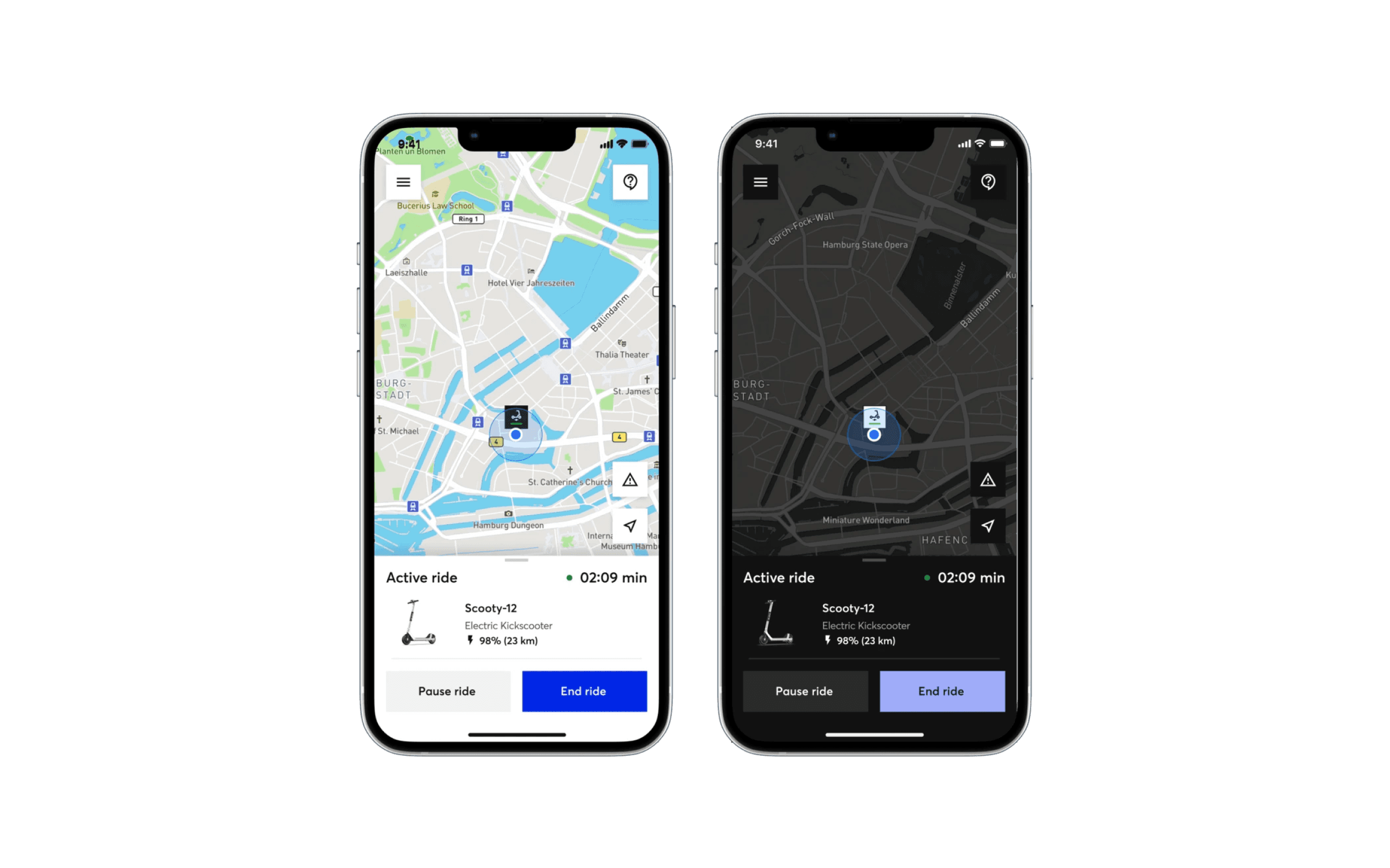

Dark Mode

Dark mode was implemented, presenting a unique challenge as color customization was limited. To ensure accessibility, the color system was carefully designed, allowing for adjustments in primary interaction colors while maintaining clear distinction from the background. Customers were provided with three options to handle their color, generating a programmatic color palette for the app.

The new system introduced key improvements:

  1. Registration Flow: Split into two steps, increasing signups by removing the initial payment method requirement.

  2. Modularity: Enhanced components for a compact and clear UI.

  3. Extended Bottom Sheet: Provided space for additional vehicle details.

  4. System Status Visibility: Implemented loading states and feedback for user confidence.

  5. Parking Mode: Refined to prevent user errors during trips.

  6. Theming: Expanded customization options and introduced predefined themes.

  7. Dark Mode: Carefully designed color system for accessibility and customization.

Impact

The changes led to increased signups on the consumer side, and improved sales support through the north-star prototype on the B2B side. However, the COVID-19 pandemic interrupted the project, and I left the company before full implementation. Despite this, the progress demonstrated the potential of the enhancements.